I have been having a research day as I have a powerpoint for tomorrow on the direction and influences on my practice. Of all the text artists I have been looking at so far it is Sean Landers that grabs my attention. It strikes me that these could be very painterly, large scale, and quick to generate using a free hand and the source materials that I have already been looking at in terms of ‘low’ end women magazines.
It would do no harm to test these more on paper to see how this layering of information would work.
Also, if you are to use one magazine as your source material, then why stop there? Use a different newspaper, lads mag, whatever. But something that is a pinpoint of social history?
I want to have a play at this one as it does tick some boxes and at this point all options need to be considered.
I have been busy in the studio over the last few days. After some general research on text and art I am struck by the idea of a tension between an image and a text. How that text also becomes an image? How language is open to interpretation, abuse and humor. I am not sure of my future direction as yet as I still need to be better grounded on the art history of text in painting and other media but also an array of artists using text in their work. I have a long list to work through but for now, I always need to get the balance right and have been testing ideas in the studio. I have 5 studies which are on MDF on either a4 or a5 size as follows:
Each sample is testing something different. My starting point is the Christopher Wool/Richard Prince idea of slurring words one into the other so that the viewer has to work to get the information. I quite like this but I am not sure if its the way to go.
Also, I wanted to combine an image with text. To play with the idea of a tension and misunderstanding.
Other decisions have been source material. Do I go for popular culture cliche or famous art quotes, like the Kothus ‘art as idea, as idea’ and the lightbulb image.
Or so I want this at all, do I want it to be more lighthearted and poking humor at our soundbite society.
Other things to consider so the distance from the viewer at which point the text is legible. As these are only small text pieces it does underline the need to really upscale when I am progressing to more refined works for the final exhibition.
Using stencils and correcting them by hand, or just using your own handwriting, these are all things I have to now consider. I need to sharpen my own critical awareness and source material to decide what is working and what is not but I am pleased for now that I have begun to play. To see the effect text can fully have in a work, whether in its totality or accompanied by a more traditional image.
I am not sure at all.
We got our module feedback from last semester as a final grade on Wednesday and its fair to say I was disappointed with the result. There was certainly some blood on the carpet so you need time to digest and stand back a little to allow yourself to move forward. I have been doing some more research, the Art and Text book was especially good and has given me a good grounding, as has ‘Writing on the Wall’ by Simon Morley. I have been scribbling lots of ideas and playing with ambiguity and words and visuals but of course, for it to have any value it needs to be respectfully in understanding of those who have gone before you and located in contemporary culture. To language is to be the content and paint the medium but I need to question my source material with regard to mass media and ‘low’ female magazine culture as a source material. Although I am still clinging onto this, I am not sure if I need to jettison this also and move away from it completely. That in a way I don’t need to anymore. So there is so much information that it is almost too much for now but I need to get a good grounding of ideas before I can fine tune my direction and knowledge is the key. I think my lesson this year is keep it simple and keep it honest. Its all about the integrity of the paint for me and I want to enjoy the medium as much as I can and the experience before university comes to an end.
I was quickly playing with the start of ideas in the studio yesterday and my research wall looks like this at the moment.
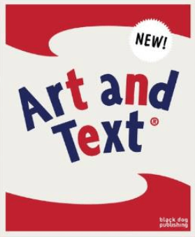
Today I started my research. I have started with Art and Text which starts with 3 academic essays and takes you through the types of text art. This will give me a far greater understanding of the historical context of text paintings and artists to research and plunder for ideas moving forward. The essays are always a great place to start for extracting wordings for artist statements later on. So, just at the start but I feel confident that I am going in the right direction.
Its nice to see the link between the book and the Warhol brillo boxes I saw on friday. A nice link.
Today I went to see the Warhol show at Tate Liverpool. I have watched a documentary on Warhol before so the show was pretty much what I had expected but it was enjoyable to see so many of his works on display in the one place. Of most interest, in that it was not an over used image was the surround sound, full 4 wall video piece, complete with disco lights where the viewer actually became part of the work as you stood inside the large space. Great to immerse yourself within the world of Warhol and the era as the music bounced around the space and you watched various images move around including more than a few suggestive queer imagery that even how is perceived by the viewer to be voyeuristic and close to the bone.
I also find Warhol personally interesting for his use of commodity and fame, consumerism and popular culture as his themes. There is a parallel in this with the magazines I have been looking at as part of last year. Every artist is at their best when they comment on the times they actually live in and what they are exposed to, and their viewers around them. The artist as commodity and the consumed? Not much else going on at the Tate at the moment as the other levels I have seen before. Sadly, just a postcard of a Christopher Wool work and not the real thing. I would have enjoyed seeing that now.
We then went up to the Walker where there is a small display by the photographer Catherine Opie which I thought were deeply thoughtful and sensitively done. The large exhibition space at the rear of the Walker was closed at present so again, not much new to see but always good to revisit earlier friends and appreciate them with new eyes as my knowledge and experience develop.