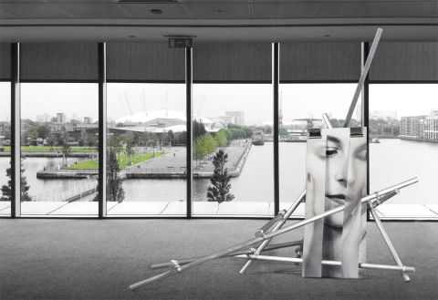
I’ve just finished the second version of Not at Clifford Chance (top right), which investigates how multiple small images fair when placed on a complex scaffolding support structure.

I’ve got mixed feeling about the results. On one hand, the general approach fits well with my original vision of multiple images interrupting and disrupting each other. However the metal structure in itself makes a strong architectural statement, and in this case using it to support multiple images seems to weaken both collage and sculpture; the final results are simply too busy competing with each other. Perhaps the simplicity of version 1, where the structure supported a single collage, is as far as this marriage of two parts can go? But if so, what does the sculpture add — is the picture as effective just mounted direct onto a wall? I also question if the scaffolding is a piece in its own right, devoid of collage (bottom right)?

In the shadow of her gaze n.02 http://www.tate.org.uk/whats-on/tate-modern/exhibition/richard-hamilton?gclid=CMLNpbCW77wCFSsKwwodlpoAJw() didn’t suffer with these issues, possibly as its metal rods all reach upwards within one plane.

I visited Richard Hamilton’s (http://www.tate.org.uk/whats-on/tate-modern/exhibi…) new exhibition at Tate Modern this week with a friend. There’s a box structure in room 1, Growth and Form, 1949 – 1951, where fine metal rods delineate the planes of a cube. Perhaps re-arranging the scaffolding in a similar uniform way might deliver a more appropriate support structure? A mirrored pillar positioned in the centre of the arrangement could generate interesting reflections?

The way Hamilton handles reflection within the Tate show is interesting. At some points they’re true — real mirrored pillars in the middle of a room, dividing the frame, pulling viewer and works behind them into the picture. At other times they’re virtual; painted into pictures in an ambiguous way that make it difficult to tell if Hamilton is depicting real space or reflection.

I’m finding reflection everywhere at the moment…or perhaps this mirrors my current state of obsession?!

Three things to test:

This version of scaffolding accompanied by a simple collage
One collage directly mounted onto a wall
Scaffolding, cubed


0 Comments

Yesterday was one of the most productive trips I’ve had to London for ages. I’m blogging to distil my thoughts to separate the essential wheat from the nice-to-know chaff and I’m aware what I say leaps from one topic to another, but please bear with me!

Seeing work by Hannah Hoch and Kader Attia at the Whitechapel Gallery yesterday compels me to say:

Collage activates; it uses the alienated components it’s made from to produce something new. Not a new entity as such, but an attempted repair of the old. If this repair is successful and fully resolved, the matter may end there, but if not, one is driven to repeat.

This statement isn’t blindingly new — I’ve been in this territory for some time — but it reflects a refining of my views.

Hoch’s post war work leads me to question how I’ve collaged a piece like To adorn. It uses a decoupage layered approach to order objects by scale, whereas Hoch’s arrangements put colour, line and form mounted flatly to work to deliver a fantasy. From a distance, their quality is organic and leaf-like and the detailed otherness of their components is revealed only by close inspection. Although more symmetrically organised in its approach, to some extent the Cornelia Parker piece, right, has some similar qualities.

I’m due to make a piece for an exhibition later this year responding to the collection of Maidstone Museum. Wandering round the museum a painting by Petrus Schotanus, Vanitas: still life with a globe, has seduced me, triggering the response to take one volume of Vogue and collage all the images of women and fashion into a single frame of excessive vanitas. However, questions posed by Hoch and Parker’s pieces demand I rethink how the elements of this are arranged and attached in more detail.

On another tack, Attia’s use of mirrors take his piece to a fascinating place; an endlessly repeating reflection of architecture and artwork bounced back and forth between dual mirrors. This has tremendous possibilities to multiply the images and interference of the In the shadow of her gaze series. Why stop at vertical reflection? A second piece could add its voice with angled refraction, and so on, endlessly. The only practical way to test this is, I think to make a virtual gallery space to scale and explore what happens.

In the down time between exhibitions and talking to friends, I read Janice Galloway’s The Trick is to Keep Breathing (London: Vintage Books, 1999). It’s described as an account from the inside of a mind that’s cracking up. Galloway’s approach is to fracture the voice heard, dividing the experience into constantly shifting perspectives and events, half finished, incomplete, and dislocating certainty in the reading position. It’s unsettling — nausea-provoking to some extent — but also compelling. The words don’t only tell the story but provoke some semblance of the emotions felt by the voice recounting the tale. It embeds heightened emotions into the experience, something I strived for to a lesser extent in the way my research paper (http://clairemanning.co.uk/critical.html) is written. But could I develop this further? What would happen to the readers experience if, rather than being linear, ideas looped back and forth — a collaging of perspectives, interrupting each other only to come back into clearer focus once again?


0 Comments

I’ve finished the goal I set myself last post and re-evaluated my work from the perspective of my research paper on the mutability of the gaze. To the casual observer, it might seem like little shifted but for me it’s been a key step that’s resulted in some difficult pieces of a puzzle finally dropping into place.

The end result — its physical manifestation — has been a form of editing and tidying up of my thoughts and my website. My research paper now no longer refers to the work of Annette Messager but talks in broad terms about impacts on reflection, photographs and images, all things key to my practice. I consciously decided not to discuss specific pieces of my work in the revised paper and have heavily condensed the end results. The introduction and end thoughts appear in their entirety but each different viewing perspective is condensed down to a simple statement — one that can be expanded to full detail if the reader wishes. To my mind, this is much more user friendly — one can understand the general gist of what I’m saying and drill down further into any areas of interest.

I’ve revised what I say about individual pieces of my work in line with this, and they now talk less about gender stereotypes in favour of saying more about the general mutability of the gaze.

I realise my research paper is essentially a general enquiry into specific factors that influence the gaze — a fact-finding mission allowing me to better understand what takes place when looking. One could ask, why bother — what I’ve written doesn’t provide any substantial solutions? However, I see it as a quest to better comprehend the world around me so I can better understand myself. The paper could be taken forward into a number of different research areas but, currently, there are no burning questions I wish to develop, so at the moment the paper is an end in itself.


0 Comments

Installations that never were…

I’ve two pieces of work I view as installations which move the collages I make from a fixed relationship with the wall to a shifting one. However, reliance on a solid vertical surface remains a constraint I’d like to dispense with, possibly by using scaffolding as a material. It’s something I’ve never worked with before and involves a significant increase in scale so experimentation, space and funding are needed to think through how this might look. Getting immersed in the competitive arena of awards and grants naturally leads to rejected proposals and flights of fancy impractical to realise at the moment. What happens to such half-formed projects? Should they disappear into the ether or be captured in some form?

With some trial and error, I’ve found ways to think through these ideas as accurately as possible using scale maquettes dropped into different environments. This opens up delicious chances to see the work in any gallery space I wish…at the Tate, the Saatchi gallery, historic locations…

This series of work is a set of installations proposed but not realised. Possibilities for freeing In the shadow of her gaze n.02 from its reliance with the wall and capable of delivery in scaffolding, made from component materials with endless options for construction and reconfiguration. They may manifest in reality at some point or remain in the virtual environment of the World Wide Web. Here is a picture of the first piece in this series.

Talking about my practice…

I can’t find a way to talk about my practice that feels entirely satisfying. I discussed it recently in terms of the masculine / feminine gaze but, on reflection, I feel this is too narrow and results in something that risks seeming too assured. As if I’m saying that the work always communicates certain characteristics when in fact I feel it’s more accurate to say there are a cloud of possibilities, any number of which may come into play in any given situation.

I wrote about the mutability of the gaze in a recent research paper. It seems obvious now but the solution may be to read the work from the perspective of this paper and see what results. It will definitely be woolly – in the territory of a ‘cloud of possibilities’ — but perhaps more accurately reflect my thoughts with the value of blending both research and practice.

If I document this experience for myself in some detail, it will work as an aide memoire for future use.

Wish me luck…


0 Comments

The latest piece in the collage abuse series – TO FOLD

As usual, I made the smaller 16 x 25 cm piece (above) first to test images and theory, then moved on to a larger 41 x 66 cm version (below). This latter one was a struggle to make – it’s clipped rather than permanently glued and it proved hard to get so many layers of paper to behave.

Despite this, I prefer the larger one – more layers, resulting in more disjuncture.

Does collage abusing the Queen’s portrait mean a knighthood is out?


0 Comments