
Following on from my discussion with Srin regarding my final prints, I am happy with the paper for this print, the use of image and the colours. The lining up between layers was very successful. However, Srin spoke about how the lines in the print below are too thick on 12/05/21 and may be too contrasting with the text within the mouth. I quite liked this though because it I think it flows nicely with the thickness of the block above, to a thinner line surrounding the image, to thinner text.


I had really enjoyed Ink Spills by Lol Gallimore and the use of bright colour but I felt with the imagery, the text and the kind of work I am woeking with it didn’t feel right to use lots of colour. I had previously experimented with pastel toned papers as a background for the main image but they turned out to be too busy for the text and the image. I feel like the simplicity of the colours/layers works well for this print.
On 16/05/21 I decided to take this advice on by thinning the lines very slightly so they’re less bold contrasting and I think it frames the print much less harshly. I like the simplicity of the print, the contrasting colours and limited text/imagery in reflection has turned out to be a comparison to Barbara Kruger’s prints where she outlines the print in a line, like in Untitled (Not stupid enough) see below. The use of text and imagery of a mouth/face being the focal point is shared with Kruger’s work. Kruger’s Untitled is very confrontal relating to the way Marylin Monroe was always seen as not quite good enough for the male gaze. The use of text confirms this within her work and it’s the same for my print conveying ideas of pornography and objectification. Allowing the viewer to read and connect the visuals to form the idea I want them to have/think, just like Kruger’s ability.
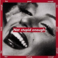
Barbara Kruger, Untitled (Not stupid enough), 1997.
I printed 30 of these for the final print, see below.


I was very happy with the way the other print came out and with this idea in mind, I took to changing the other print the same way as I felt something was missing. Previously I had experimented with a yellow gradient and 3 images in pink as the yellow had always complimented the pink but it almost was too confusing as to tell what was happening in the images, see below.

Especially when on the chosen brown paper the ink turns to orange, it was hard to find the contrast/image and to define what was in the mouth. I wanted there to be a similarity between prints so I followed the same colour scheme as the print above with pink and black and removed the yellow. I liked it but felt it wasn’t right for this series of work. I created the stencil below to frame the series of 3 images see stencils below so it continues the momentum between prints, I wanted a clear distinction that they’re separate prints but to still follow the same appearance/scheme.


Printing them was very effective and now has this quality of looking like an old fashioned photo strip of film strip. Especially as the stills were taken from the film To Bite B&W Repeat it enforces this film strip quality even more. I wanted to introduce different thickness of lines to this print to match in with the variation displayed in the previous print. I think the black lines replacing the yellow background changes the perception of the pink on brown as the black lines redefines the 3 images to be recognised as separate images, you can see the breast much more clearly and almost stands out more.


NOTE: I am yet to complete the documentation of these for my blog and my portfolio.
Reflection 27/05/21: We had our final print session today where we as a group signed our prints, organised the order of them for the boxes and then boxed them up. See the process below, we lined all our prints up together to work out an order of where our work should sit together. I really enjoyed this module as I learnt a new skill within printing. We created 30 prints in total of each print in total as some are kept for sales on the uni website.


See final images of prints below which are used for my portfolio. I thought of staging them as I would for an exhibition and used bulldog clips. They feel very professional and I am really happy with them. I chose to title them in relation to my work/films so there is a continual flow from degree project to print.

