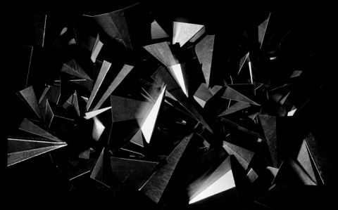
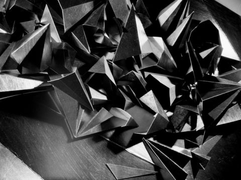
A collaboration between artist Charley Peters and photographer Eddie Otchere. We will be making, discussing and probably disagreeing about work while developing a dialogue between the analogue processes of drawing and chemical photography.

Project supported by an a-n New Collaborations Bursary.


0 Comments

<CP>

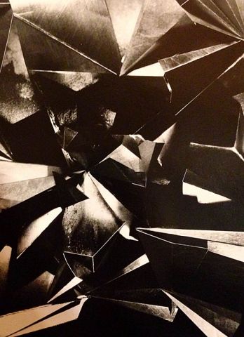
Eddie surprised me this week, which is nothing new, except that this was quite a nice surprise for once. He’d secretly booked a day in the darkroom on his own to print some of our negatives, after which I was unexpectedly presented with a box of new work to look through. I’ve already expressed a preference for staying out of the darkroom for the good of the project (and indeed, my sanity) so this felt like the perfect conclusion to our first phase of production together. Firstly, I have to thank Eddie for taking the initiative in the first place and for making so many prints. Now, with the benefit of hindsight, I can see that they initially received a rather mixed reception from me, and maybe this was unfair. I have to admit to being slightly underwhelmed with them on first inspection, but after a couple of days dwelling on them I am starting to look at them more favourably. I’ll try to explain my feelings about them and what I think I need to do to address these.

Eddie’s prints raised a couple of interesting issues for me, firstly, that I don’t really know what photography looks like any more. Photography isn’t the pin sharp, hyper-real image on the backlit screen of the laptop, which can be adjusted to suit my viewing taste by hammering the contrast buttons on my keyboard, or zooming in and out to adjust scale. It’s a fixed, flat experience that shows what is actually on the negative, and not the interpretation of the negative that I see in my mind’s eye. I think I really need to look at more photography, real prints, and not just images on a screen. It seems quite possible that I’ve been confusing the real experience of photography (or more specifically, photographic printing) with the imaginary imprints of lines, light and space left inside my head after looking at our initial scans of the contact sheets on a pixellated screen. To me, photography still feels like a mysterious practice carried out blind, as opposed to the visual, experiential process of drawing. I think I’ve identified a shortcoming in my experience and an unrealistic expectation of what a hand-printed photograph is, and will be investing some time in looking at real examples of prints as soon as possible.

The second issue that arose was that, although delighted that it wasn’t me in the darkroom doing all the messy work, I’m now not entirely sure that being absent from the process has resulted in Eddie making work that I feel is mine. By that I don’t mean that he’s worked on my behalf as a skilled technician or fabricator, which I wouldn’t necessarily mind, but moreover that he’s interpreted the work in a way that is unique to him. He didn’t print the negatives that I had highlighted on the contact sheet, he had (of course) ignored those ones and chosen the ones that he liked best. Instantly I found this frustrating and annoying. But maybe I shouldn’t, perhaps this initial set of prints is Eddie’s work, his vision and how he thinks it best to document our collaboration. Although we had talked at length about what we like, see and are excited about in the contact sheets, how does this translate to one creative person ‘making’ or ‘finalising’ work that has to that point been a dialogue between two voices? Does it naturally default to the dominant voice of the one person present in the darkroom? I found his prints – or maybe I mean his interpretation of my images – too dark, too contrasty, too harsh and unforgiving, too literal and actually, maybe, too insensitive. Although beautiful prints, technically perfect and leading to interesting discussions about toning and further reworking, I felt a sense of something inevitable looming. As we sat contemplating Eddie’s pile of prints I heard a voice say, ‘I think I should make a set of my own’.

To my surprise, that voice was mine.

0 Comments

<CP>

After a short Christmas break Eddie and have been talking business again. So far we have edited the material produced from two studio sessions down to a handful of negatives from which we will produce darkroom prints. It probably goes without saying that we didn’t always agree on which images were strong enough to make the final cut; Eddie favouring photographs that accurately recorded our studio set ups, while I preferred more abstract, hard-to-read images – all of which Eddie deemed ‘bad photographs’. Negotiations were long and frustrating but I think we have now argued ourselves into a shortlist of several negatives that we are excited about (they are however, not necessarily the same ones).

I’ve had to let go of the idea that the screen of my laptop tells me the truth when I look at images. Seeing the subtleties of tones, light and shadows on a photographic negative has been like inheriting a new pair of eyes after the cranked up contrast and blacked-out pixels of my macbook screen, which I’ve now been banned from using for anything other than writing this blog as far as this project is concerned before I ‘damage the legacy of the analogue photographic image’ any further than I already have done. As it happens we don’t need to touch digital technology from now on, as we’ll be keeping things hands-on in the darkroom.

We will be making a series of black and white lith prints in the next few weeks. Between you and me I was hoping that Eddie would take sole responsibility of the darkroom printing as my only previous encounters with photographic enlargers and developers have been mortifying. I can only hope that the traumatic memories of being screamed at for fogging my fellow darkroom dwellers’ photographic papers are enough to stop me from making the same mistakes again. I’m not looking forward to it…and no matter how many times I’m told that my eyes will adjust to the dark I know I’ll be able to see less than nothing and will cause some kind of incredible cock up.

In addition to the lith prints we will also produce a series of experimental images with Silverprint Emulsion SE1, a silver gelatin photo emulsion that can be applied to surfaces to make them light sensitive and able to be printed on in the darkroom. We will be exploring the possibilities of mixing graphite powder into the photo emulsion before exposing the image of the graphite drawings back onto it. This will, I suspect, either turn out to be a brilliant idea or a completely terrible one. Either way it will be an interesting process, and after my recent technical ‘quirks’ I’m slowly becoming desensitised to things going wrong.

Eddie has arranged for the one surviving colour image shot on 800T Kodak Eastman cine film (posted by Eddie in the previous blog entry), to be printed by bespoke photographic printer Danny Pope (http://www.dannypope.com). Based in London and Milan, over the past three decades he has printed works for photographers such as Eve Arnold, Andrew Catlin, Corinne Day, David Hiscock, Gian Paolo Barbieri and Terence Donovan. We will be meeting Danny – a notoriously formidable character – at the end of January to discuss the project. This is a fairly daunting prospect to be honest, and I’m already bracing myself to defend a wholly experimental body of work to someone who has made a living out of printing the work of ‘proper’ photographers. Still, she who dares, wins…or so I hope.


0 Comments

<EO>

800T

Old Kodak Eastman cine stock repackaged as 35mm stills film.

800 ISO

The only surviving colour image of the entire shoot. As old film stock in a recycled canister, it was rewound prematurely into the camera. It is a highly unusual film in that it is balanced for indoor light. Using it with daylight, LEDs or even fluorescent lighting will leave a colour cast. Given that the subject had no colour, the entire frame filled with grey graphite, this image raised issues to me about colour pollution. By contrast, the black and white film was gratifying to use as it expressed the tonal qualities in the drawings, the higher the contrast the more dramatic the recording. The colour film was grainy, soft and embued to the romance of hollywood film, there’s a red glare in the image which I think is intrinsic to the film, rather than the subject. I feel that more testing is required to explore the art of colour reproduction.

For the record, all images were matched to their contact prints, with the negatives scaned on an Imacon Flextight and cropped in Lightroom to 8×10. No Photoshop adjustments have been made, and all screens were calibrated to replicate, as best as possible, the images as they appeared on the negative.


0 Comments

<EO>

Ilford Pan F

An off the shelf back and white film, developed as standard. It behaves as expected. There’s some evidence of lens flare leading to areas of light bleeding back into the image (bottom left). There’s a full tonal range – rather than the high contrast of the CMS 20 – leading to less range of blacks and more mid-tones.


0 Comments

<EO>

Ilford Delta 100 pushed 2 stops.

What intrigued me about this set up was how the nature of the film had drastically changed by push processing. The film’s intrinsic characteristics in terms of how it records black and white, has been shifted, dramatically reducing contrast. This was accidental. The film had been incorrectly rated at 800 ISO. Realising that mistake, it was compensated for during the development process, the result of which is increased mid-tone, reduced highlight and reduced shadow. The light was tungsten 80W bulbs on a copy stand, which may have contributed to the lack of contrast.


0 Comments