<CP>
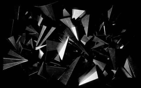
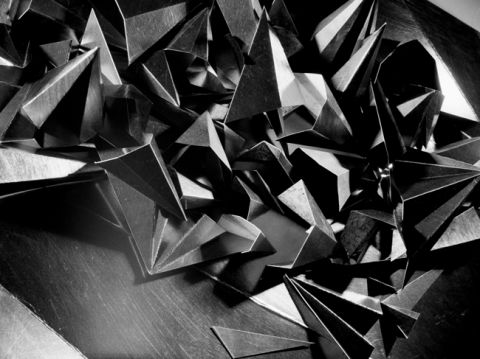
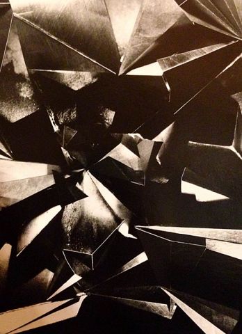
After a short Christmas break Eddie and have been talking business again. So far we have edited the material produced from two studio sessions down to a handful of negatives from which we will produce darkroom prints. It probably goes without saying that we didn’t always agree on which images were strong enough to make the final cut; Eddie favouring photographs that accurately recorded our studio set ups, while I preferred more abstract, hard-to-read images – all of which Eddie deemed ‘bad photographs’. Negotiations were long and frustrating but I think we have now argued ourselves into a shortlist of several negatives that we are excited about (they are however, not necessarily the same ones).
I’ve had to let go of the idea that the screen of my laptop tells me the truth when I look at images. Seeing the subtleties of tones, light and shadows on a photographic negative has been like inheriting a new pair of eyes after the cranked up contrast and blacked-out pixels of my macbook screen, which I’ve now been banned from using for anything other than writing this blog as far as this project is concerned before I ‘damage the legacy of the analogue photographic image’ any further than I already have done. As it happens we don’t need to touch digital technology from now on, as we’ll be keeping things hands-on in the darkroom.
We will be making a series of black and white lith prints in the next few weeks. Between you and me I was hoping that Eddie would take sole responsibility of the darkroom printing as my only previous encounters with photographic enlargers and developers have been mortifying. I can only hope that the traumatic memories of being screamed at for fogging my fellow darkroom dwellers’ photographic papers are enough to stop me from making the same mistakes again. I’m not looking forward to it…and no matter how many times I’m told that my eyes will adjust to the dark I know I’ll be able to see less than nothing and will cause some kind of incredible cock up.
In addition to the lith prints we will also produce a series of experimental images with Silverprint Emulsion SE1, a silver gelatin photo emulsion that can be applied to surfaces to make them light sensitive and able to be printed on in the darkroom. We will be exploring the possibilities of mixing graphite powder into the photo emulsion before exposing the image of the graphite drawings back onto it. This will, I suspect, either turn out to be a brilliant idea or a completely terrible one. Either way it will be an interesting process, and after my recent technical ‘quirks’ I’m slowly becoming desensitised to things going wrong.
Eddie has arranged for the one surviving colour image shot on 800T Kodak Eastman cine film (posted by Eddie in the previous blog entry), to be printed by bespoke photographic printer Danny Pope (http://www.dannypope.com). Based in London and Milan, over the past three decades he has printed works for photographers such as Eve Arnold, Andrew Catlin, Corinne Day, David Hiscock, Gian Paolo Barbieri and Terence Donovan. We will be meeting Danny – a notoriously formidable character – at the end of January to discuss the project. This is a fairly daunting prospect to be honest, and I’m already bracing myself to defend a wholly experimental body of work to someone who has made a living out of printing the work of ‘proper’ photographers. Still, she who dares, wins…or so I hope.