2 Comments

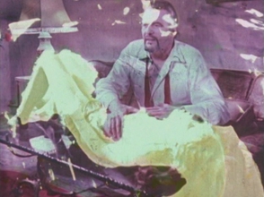
On the 21/04/21, we continued to work with our Riso prints. I had brought a range of colour/size paper to trial in the Riso, mainly pastel colours as the inks are so bold, they possibly need a soft paper behind – was something me and Srin spoke of, as well as composition and imagery. I really enjoyed the images with the text in the mouth, from Andrea Dworkin’s Pornography essay so I refined the drawings so they would sit neatly in the mouth. I think it worked well in relation to the context of image and allowed the text to not consume the main image. I decided to try the original still from To Bite, I really enjoyed this in my first printing session, it was much more clear as Sweet Tooth B&W was confusing, couldn’t see what it was. See initial digital layers I used to create a draft.

Reflection 26/04/21: The still from To Bite is very successful, it’s clear its a mouth and a beard. The definition that is picked up from the pink ink almost exploits the beard, male dominance, in a grotesque way. Very defined and unsettling especially filling an A3 piece of paper.

I aim to try the first lay (text) above in yellow and remain the main image as pink. I think with an image like this and text, it doesn’t need much else, would become confusing to have more layers. We discussed sizes of paper – I think A3 works best as these works below are all A4 and I’m unsure if I like them, they feel quite compact. See images below, the colours paper works well, slightly changes the colour of the ink depending on the colour paper. The yellow text also seems to get lost on the coloured paper, is this something I want? Almost something which surprised me was the paper almost made the colours so unusual in person they made you feel dizzy and hurt your eyes.

Reflection 26/04/21: The black text on brown paper cancels this out, it almost acts as a focus point to the print and the paper helps soften the colours.

Reflection 26/04/21: I really wanted the yellow to work but it lost the ability to read the text. Yellow maybe more successful as a black background colour? Or not use it at all? I’m unsure.


Srin mentioned black would be more striking and works well with pink, I really inked the boldness of the blue previously so I decided to use black. In comparison like the image above, the back text prints stand out much more than the yellow in the pile. It invites the reader to then read the text rather than pass it by as words they can’t see. I stuck with this and began to print on brown paper which I did really enjoy with the first image and session, see below. Alongside this, me and Srin spoke about the orientation of the page – I hadn’t considered this much so I printed on the middle of page, portrait. They seem much more finalised being larger – the black text in the middle of the mouth also centralises the image, this was the composition to work with.

Reflection 22/04/21: Me and Srin discussed it maybe worth lining the box of the print with black to centralise/contain the image. It feels slightly unfinished due to the face coming off the page. We also discussed a black box above the face where the eyes would sit, making the print portrait – almost suggests these ideas of censorship of which I discussed in this practice and my dissertation – Ideas of wanting to look but you can’t, entice people in. Lack of identity. I aim to try this when I next print.

Reflection 23/04/21: Jane mentioned there was this Barbra Kruger type quality to these prints, the bold text with an impactful image almost forcing the viewers to read/listen.

Reflection 23/04/21: After my 1-1 with Jane today, we discussed how I would feel if I used text with my film. Jane mentioned it’s become successful in prints and may work to use text within my projections/films – m ay add that extra depth. Jane also asked how I feel about colours again after using print – I’m going to work and combining both black and white with some colour to draw the eye in – like these most recent prints.

After all this experimentation, I prefer the sand/brown paper with a portrait composition. The warm tone of the paper warms up the pink print – on white I felt it looked very bold and almost florescent which is too much in previously prints. The brown paper above that has a slight glow/shine to it, it it adds this glamorised feel to the print, this may be the paper I go with for the final print. Reflection 26/04/21: Glamorising the act, the text and the representation of women today, a new form of cellophane.


0 Comments

The progress of my exhibition proposal has been going well, I have continued the exploration of using the studio at uni further this week by working larger and also by involving actual cellophane more into the space, like the digital collage I created below, rather than through the imagery.

Reflection 23/04/21: From my 1-1 with Jane, the use of colour in my Riso prints could be reflected in this exhibition proposal. In my print Is use balks text to draw the viewers eye into the work, where as here I could use colour mixed with the black and white film, to draw the audiences attention into the film/space. And possibly text? May become rather like Barbara Kruger’s work – confrontational and forceful.

19/04/21 I went into uni to sit and work in the space with daisy chaining the projectors again as it feels most successful – the mirrored image of the breast in the males mouth suggests a pair of breasts or eyes. Relates to the gaze. From my 1-1’s with Matt and Gary I learnt that film may work best in response to documenting this kind of installation so I wanted to explore this. See film below, I wanted to show the scale of the projections if people were allowed to sit and be in the space as part of the documentation process. The projection becomes quite daunting and even more aggressive when you’re so close to it like I was – a lot to take in. There also becomes this relationship to the artist and the artwork again, like Martha Rosler in Semiotics of the Kitchen, even though I am not making/doing anything, it’s the simple act fo the gaze/looking that adds to this film of the projection. Artist and artwork is something I have commented on within my practice.

Reflection 10/05/21: Upon reflection of my formative assessment, Hal Foster says in Obscene, Abject, Traumatic that “Sometimes the screen seems so torn that the object-gaze not only invades the subject-as-picture but overwhelms it.” (Foster, 1996, p113). I feel this appears this way in the film below. Discomfort and the overwhelming feeling of the act as well as the size of the projection, becomes too much for the gaze.

Reflection 26/04/21: From my 1-1 with Jane on the 23/04/21, we discussed how the use of the film above gives a good idea of the space/scale and visual of how people may perceive this work if they could in normal situations. It’s with creating a film where I am continually observing the film, rather than making notes. Gives a better perspective of gazing deeply at a grotesque thing.

Reflection 30/04/21: after my 1-1 with Gary also, we discussed how the film above may be more than a documentation piece, it could be part of the exhibition, there becomes more than watching a film of the installation, it becomes about watching the person watching the work in the space and how they respond.

I decided to record for longer between filming, it gives a better idea of the loop I have chosen to play for this endless exhibition, like Nauman, using a seamless and never ending appearance to his film Poke in the eye/ear/nose. I thought about different placements of the camera/angles of how the film could be perceived. From my group crit 24/03/21, my peers said they like the view up to the film Sweet Tooth B&W. As me and Catinca discussed, the camera becomes the audiences eye and I aim o continue to use the camera in this respects to suggest this feeling of a cinema, where you are lower looking up to watch female representation/sexualisation.

See film above, I shot this to get a feel for the space/walls and the angle suggests the way you try to look but you may not want to. It encourages this ideas of the grotesque/disgust of a female intimate area being physically consumed. “She is isolated, glamorous, on display, sexualised” (Mulvey, 1973, p). “Mainstream film coded the erotic into the language of the dominant patriarchal order” (Mulvey, 1973, p59).

Yet with the film above, it feels intrusive and unapologetic. This is what I want when it comes to the exhibition proposal, I think the studio space works so well with the type of projection – I will need the space to be darker but this can be sorted. There is a good development from my initial drawings etc. Reflection 26/04/21: Regarding my 1-1 with Jane 23/04/21, it was mentioned that the film may worked well if it is projected onto two separate walls – the audience will have to look at both continually to see if they miss anything out e.g. will suggests it’s out of sync.


On the 21/04/21 I brought cellophane into the studio. As my original idea in my digital drawings was to create a space with cellophane draped etc, I felt I needed to try it and as me and Gary mentioned in my 1-1 15/04/21, to not over complicate it, the work doesn’t need it. But I think these also work well in relation to bring the film/experience to the environment, like Are You Watching? and CUBED. I think there is more of a relation to CUBED here as CUBED was more interactive int he sense you could physically go into the space, where as Are You Watching? was very intimate/personal as it was my home, and the camera did the looking/viewing for the audience. There are ideas of pornography and may always will be but it is important to note that pornography acts as the cinema, where it creates a situation/context to normalise it. The use of the large projections, creating a double suggests this warped version of the cinema/representation of women and the visual of sexual objectification you don’t often see at the cinema, but do in pornography, they of course glamorise it too.

Reflection 29/04/21: my 1-1 with Gary today made me consider more about the audience, Gary as a man, saw the work as male violence towards women, my peers see it more as consumption and male control over the women – this is where I also see it. I don’t see violence. I think that word is too strong for the work to be considered ‘violent’, but it slightly aggressive as the male chews. I need to consider the ways both men and women will view this work. Do I want this drastic perspective? Will men and women always see differently depending on society and experiences?

I really enjoy the low angles, giving a glimpse of the cellophane helps picture what it is – they continue the thoughts of the peering gaze/looking at something you shouldn’t which have all been comments made my peers and tutors throughout documenting this work, especially in group crit 24/03/21.

I think it might be interesting to have a movement film, like from Are You Watching? and the last film above for the exhibition proposal. Or does the focus only need to be on the film/placement? It will allow the viewers to see more of the space and the sparkle from the projector onto the cellophane. Creates a more in-depth perception of the cellophane as this glorifying material, covering, but not covering, up the action happening behind. In the image below, I edited it to appear similar to Sweet Box where I installed carpet into the cardboard box to have a visual of a soft but destructive experience. I tried to bring this back into the still and I think it’s something I am going to have to experiment with – actual carpet or digital manipulation? Is it needed? It think the darker floor creates a more cinematic space.

Reflection 26/04/21: After my 1-1 with Jane 23/04/21, it was mentioned that a movement of the space works well in relation to see more of it. As no one can visit, it is good to create videos like this for the audience online can envision as much of the space/exhibition/work as they can. it’s interesting because it’s all through the artists eye, which normally it is the audience control to see what they want to see.


0 Comments

After discussing my first prints for the Riso with Srin last week, I wanted to get more hands on e.g. think about layering, the formation of colours and possibly text. I created these stencils with no bitmap to play around with the appearance of photos from the Riso, currently I am considering pornography within my practice, Andrea Dworkin’s text struck me as quite aggressive and angry, similarly to my still/films of Sweet Tooth B&W. I wanted to work with text within print and decided to play around with Dworkin’s text from “Pornography: Men Possessing Women”. Me and Srin spoke of placement within the image, I had thoughts of replacing the breast in the mouth with a section of text from Dworkin’s passage to combine these ideas, as well as experimenting with movement of the text around the page. See stencils below.

Reflection 30/04/21: This has been working really well – text and imagery. The boldness, instead of coloured text I have decided to go with black. It more readable and acknowledges the thoughts among the print.

See simple mock ups below of how I wish the print to look as an outcome. The text may add depth to the image and capture the viewers attention for longer.

Reflection 19/04/21: As I printed these I realised how unrecognisable the main layer of Sweet Tooth B&W is. I feel you can see the breast if you know what to look for, this is a similar issue I was having from my 1-1 with Gary 15/04/21, there can be a line where you play with the image too much it looses its identity. I may have to use To Bite imagery instead, one which hasn’t been over layered with cellophane.


Andy Warhol is known for his screen prints, especially the one of Marilyn Monroe. He uses the coloured ink to highlight the important parts/well known parts of Monroe – “her iconic lips are boldly colored a deep red” (Masterworks Fine Art Gallery, n.d.), “her platinum blonde hair by adding variants of yellow” (Masterworks Fine Art Gallery, n.d.), see below. This is what I have carried out within this experimentation of prints using pornographic text to embody the breast, of which represents a women to explore these ideas of sexual objectification through a print sense instead. The use of bold colour in Warhols prints suggest the vibrancy Monroe lived and this glamorisation of herself which came from the cinema and the male gaze.

Andy Warhol, Marilyn Monroe, 1967.


The use of paper within this experiment was very weak as I am yet to buy coloured card/paper – the white worked really well with vibrancy for the inks, I learnt I prefer the neon quality of the inks. Where as the brown paper dulls the actual ink, absorbing its boldness, especially the yellow, see below. Reflecting on the previous prints I did, I prefer the sand like colour – I think it was soft enough to act as a base colour for the print. Maybe my paper of choice for submission after more trials. I aim to try documenting these in situ of the studio too but the documentation of the colours work well in the sun. – Work with better placement.

Reflection 20/04/21: After reviewing these prints, I felt they looked flat, the image was lost – I have recently created some extra layers to add depth to the prints including – coloured paper, text, imagery (photo or bitmap, or both?) and then a digital drawing on top highlighting breast/mouth. I felt the mouth/breast was lost in these experiments and I want them to be the main focus.

I think pastel coloured paper may work really well with these prints. Like Warhol uses a background to work off, I feel a background colour, instead of a gradient, would give more depth and tonality to the image. I previously tried colour paper and it was very effective, giving the ink more of a base.

I really enjoyed the photographic look the print as well to these images. Before I just used bitmap for all layers, would be good to work with a mix of textures with the levels. I feel I could use a bitmap layer as the final finisher on top instead to add depth and they feel quite flat without a gradient.


I firstly experimented with blue and pink – I felt like the blue text dominated the image while experimenting with a number of lay outs, the main focus of the print and felt quite dark see below. I didn’t like this however, I feel yellow and pink work best in relation to layering and soft-ness as well as the ideas that come with women’s representation in pornography. I feel the ‘pretty colours’ relate to the glamorisation of destruction in the image – cellophane glamorising the breast being eaten. ‘Pretty colours’ act as a new form of cellophane.

Reflection 20/04/21: I felt the blue was too bold/contrasting for the text – I aim to trial black as an over lay (digital drawing) to redefine the mouth and use the paler colour (yellow) for the text so it doesn’t draw too much attention away from the main imagery.

The side format of the type is interesting blue – this would work well if the photo was more recognisable – the blue text isn’t as distracting. But layered completely over the breast isn’t appealing, I feel the yellow is less distracting but works quietly with the context of the photo as well as being visually pleasing considering the image.

I also combined some life drawings with text and photography, this was to experiment with how drawing would come out like – I liked them but I wasn’t sure they worked with so much already going on. I threw them off centre.

I am having a crit like session 21/04/21 to assess these images/context/paper and colours to get feedback with how to approach the next lot of prints.


0 Comments

Reflection 26/04/21: These 1-1’s were very useful in the fact that they were both male responses to my work. I discussed with Jane on 23/04/21 the male reception of these works is just as successful as the other responses I have had. It’s important to remember/acknowledge that men find these works just as uncomfortable as women, means it working.

I met with Jane and took Sweet Tooth B&W projected images with cellophane into uni and finally used the daisy chain effect on the projectors – linking two projections projecting the same image. From my group crit 24/03/21, it was discussed that I could look at ways of projecting the films/images further but to continue down the ‘old fashioned’ film path route which is working really well. I really enjoyed this process and mirrored projection, it transformed the way the film is seen, making it even more uncomfortable and intimate suggesting a pair of breasts see below.

Reflection 18/04/21: Gary in my 15/04/21 1-1 suggested the pair look like eyes, a watching gaze back at the viewer – this was a comment mentioned in 24/03/21 by a peer that said the one breast looked like a singular eye, made it uncomfortable. As though you’re being caught looking.

I had a 1-1 with Gary and Matt on the 15/04/21 regarding these new images. See initial notes below from both tutorials. It was really interesting to see that straight away there was this strange look they gave trying to figure out what is happening. As I had experimented with these images it was also clear to me that the breast was becoming unidentifiable and I wasn’t sure how I felt about it. This was something Gary picked up on in image below, is there a point where the projection becomes too distorted that it plays with the work too much?

I am currently playing with some of the colours/editing on these images/films as I really liked the original grunge look of the colours but also think they work as well as b&w – intensify the act. The cellophane in the projection feels as though its in the space, if I brought it into the space as well would it be too much? – An encapsulating space. Gary mentioned that there’s something visceral about a mouth and breast being black and white, so close up. Plays with the psychology of consumption and this desired approach of the mouth from fetishisation/sexualisation even further as there’s no colour to ‘pretty’ up the act. It becomes weird to look at someone eating, let alone a breast in a mouth and double – uncanny. NOTES: I also wanted to involve within my current work a comment from group crit 19/02/21 where there was a defined difference between projection and space, see below.


I wanted to focus in on the mouth while I projected, experimenting for our exhibition proposals, to see how the space would work – floors, corners and walls. Consuming the walls of the projection really helped zone the eye to the uncomfortable, you’re forced to see it. As Matt mentioned in the 1-1, there’s two different dismembering acts of the women present, focusing of this objectification – violence is implied where there can be male dominance, as well as the intimate act of a breast and mouth. There’s two angles of uncomfortableness where my work is still unnatural to the human eye. Like films/cinemas, pornography plays with context to normalise the situation – sex, where as my films suggest the unnatural to get attention and discomfort to see all that is wrong with sexual objectification within life, pornography and the cinema. Matt suggested my work looks film stills: Jacques Bouffard and French philosopher George Bataille, Mouth novels. Bataille makes the human areas connect deeply to bring back the natural/uncomfortable.

Reflection 10/05/21: Hal Foster quotes about Shermans Untitled #190 that “This body is the primary site of the abject” (Foster, 1996, p 111) and I think this is present within these projections too, the body – the mouth is the main focus and the act becomes the main “terror” as Kristeva says, of the abject.

NOTE: I like this uncertainty that comes with my work, until you begin to see what is in the mouth, it becomes uncomfortable and unusual. Gary mentioned to hold this level of attention and to not confuse the viewer too much. Keep it simple and eye catching/not look away – Freudian.

Gary mentioned J G Ballard film Crash – works with fetishisation and pornography – could explore through the ideas of violence/destruction.

While stretching the projection onto the floor, see below, like I have done previously this year with To Squeeze/Only Touch With CLEAN Hands, they begin to look distorted, something I have played around a lot with this year and really enjoyed. I liked the depth to these images, there’s photography, projection of photography with cellophane and now more projection and working with natural distortion within the space. This kind of projection would play well within a gallery space, feels interactive almost, having to walk around/into it to see more or work out what is happening. The immersive-ness from the two walls is something to develop further, like Yayoi Kasuma, as it would also making an interesting space – feelings of not being able to escape.

Reflection 18/04/21: The floor projections created a grainy appearance to the mouth/face, working with the stubble – suggests Serra’s old fashioned Hand Catching Lead films, this use of repetition.


This lead me to involve objects/boxes. The use of projecting onto a box reminded me of Naomi Uman’s Removed – visually objectifying the women in the film with white, suggests the same way I have in my projection, using the box below, to highlight the breast, to make the breast more of an object in front of you. – Definitely something to work further with. I combined the distortion and the objectification in one. As discussed with Matt, it’s an even closer angle of what its happening in the film, an isolation of the violent/sexual act. – Abjection of the body/uneasy. Tony Oursler was a name mentioned again! Previously mentioned my peers. Oursler works with fabric/projection, where objects become the host of the work, like the box does with my work below.

After experimenting with rough surfaces such as the floor/wall, I enjoyed the effect within the film, it aded the grainy and unusual look/old fashioned film. I aim to experiment with cellophane within the space as well to slightly recreate Sweet Box with the projection/cellophane but in person to see how it comes across too.


0 Comments

I began to research Andrea Dworkin’s Pornography: Men Possessing Women essay. Jane mentioned I should start searching the representation of women in pornography as have previously spoken lightly about it. Dworkin addresses that pornography creates this “truly obscene idea that sex and the domination of women must be combined” (Dworkin, 1981, p199) and even though this essay is 40 years old, it stills carries the same ideas now of women in sexual situations, if not worse. “With technological advanced methods of graphic depiction, real women are required for the depiction as such to exist” (Dworkin, 1981, p200). Technology makes it more real/more visual as these women are real people and real situations, it puts the perspective into the viewers mind that that is how they should also treat women in real life. Previously I have spoken about male domination over women in my work and especially visually within Sweet Tooth B&W – chewing suggests this destructive tense control that does also suggest visual of female representation in sexual situations. See the essay below, I have highlighted the quotations which relates out to my practice and notes my initial thoughts.

I’m surprised I’m enjoying this topic I feel quite passionate about it and feel it may take my work further forward in regards to the cinema, representation and forms of confrontation.

Reflection 26/05/21: I wish I approach pornography sooner as there is so much to learn and work with regarding female representation. Along pornography stands fetishism and it is a topic Sigmund Freud focused in on and is something I discussed slightly within my dissertation. I hope to take this further as fetishism was originally discussed by Freud as a male perversion which stemmed from anxiety castration, as “if a woman had been castrated, then his own possession of a penis was in danger” (Freud, 1927, p153). And from my dissertation I wrote “From this the child pans down the mother and focuses on the feet; this introduces the theory of fetishization and acts as a “sexual satisfaction” (Freud, 1927, p153) for the male, which acts as a distraction from the violence of castration.” (Lockwood, 2021). Feet become the fetish and with this many other things become fetishised, especially revolving women and form while aligns with pornography and it further impacts further the way women are seen as sexual beings and objects.


Dworkin writes, “Whores exist only within framework of male sexual domination. Whores exist to serve men sexually.” (Dworkin, 1981, p200). Pornography derives from ancient greek which means “writings about whores” – there’s this suggestion that women and sex have always been referred to as whores, as though that is all they are and all they will be when it comes to sex. There automatically comes this idea that women, ‘whores’, only have the purpose to serve them sexually and have no control over domination – it’s quite upsetting and disturbing. Dworkin writings are so well written, she’s very straight to the point, no dancing around the subject, feels very factual yet confrontational. This is the same angle I am trying to approach with my practice, quite raw and disturbing visuals in a uneasy environment, hoping for impact.

  • During this research, there is this similarity to the cold and isolating feel of women in pornography, as though they don’t have a voice/say, this is presented in the dark space within Sweet Box – experimentation for my exhibition installation proposal, showcasing the visual effect of women being consumed.

It makes it impossible for women to to not be sexualised and seen as an object of desire – as pornography isn’t going to change, neither will society’s view/men’s view on women. Even though pornography is easier to get hold of now due to technology, cinemas follow a very similar path, as said before, glorifying and sexualising the female figure almost plays to pornography in a twister way.

“Men have created the group, the type, the concept, the epithet, the insult, the industry, the trade, the commodity, the reality of woman as whore” (Dworkin, 1981, p200).

Reflection 26/05/21: I have used this text above from Dworkin’s book within one of my prints for the workshop – it sums up the stigmatised sexual objectification women face in both the cinema and pornography. I have also referred to this through my current projections and is something I hope to continue to explore after my degree.


I moved onto chapter Whores, Dworkin states “the sexual colonisation of women bodies is a material reality, men control the sexual and reproductive uses of women’s body” (Dworkin, 1981, p203) – “the institution of control include law, marriage, prosititution, pornography, health care, the economy, organised religion, and systematised physical aggression against women (for instance, in rape and battery)” (Dworkin, 1981, p203). “The ideology of male sexual domination posits that men are superior to women by virtue of their penises” (Dworkin, 1981, p203), this relates to Freud’s Penis Envy theory which is reflected in pornography and the cinema, men hold a level of dominance over women who apparently as Freud writes, wish to possess a penis, is continued through sexual control.

It’s interesting to note that women in sex are seen as whores, whereas men in sex are seen as “pimps of pornography”, they are “hailed by leftists as saviours and savants” (Dworkin, 1981, p208). Women are seen to “embrace herself as a whore” and abide to those labels so ultimately there is no escape. “Rene Guyon, who argued for male defined sexual liberation, writes that “Women ages much sooner. Much earlier in life she looses her freshness, her charm, and begins to look withered or overripe. She ceases to be an object of desire” (Dworkin, 1981, p205), suggesting to women and men that there is a negative outlook on growing old, especially as pornography and films idealise the ideal women/figure.


Dworkin’s writings reminded me of Naomi Uman’s work who I researched at the beginning of L5, Removed in particular, see below. Uman uses pornography and to exploit the sexual objectification that is present within the porn industry by showing “the naked woman, an object of desire, is removed from the image with bleach and nail varnish.” (IFFR, 2000), there’s this destruction of the actual film/image/women being reverted down to an object, nothing more, of which a man has sex with, showing the objectification women face in porn and real life, see film below. Uman’s film feels as abrupt as Dworkin’s writings, they’re bullet statements which feel powerful and straight to the point, the same as Uman’s clear visual of the women.

Reflection 30/04/21: Me and Jane spoke in a 1-1 where it may be good to revise using areas of colour back into my work to work with almost highlight the objectification/consumption, like Uman does, upon the women in Sweet Tooth B&W.

“It’s hard to watch removed without thinking about the laborious work involved in erasing the women from each and every frame of the filmstrip using nail polish remover and bleach” (Rymes, 2017). It draws the attention of the male viewers and all that is wrong with the male gaze as well as porn and sexual objectification, making it almost humorous in a though provoking way. “Uman’s celebrated film is a smart retort to pornography’s obsessive gaze at the female body” (IMDb, 1999) that may perhaps always continue.

Naomi Uman, Removed, 1999.

There’s the ghost like quality to the women, as an object the colouration is cream and moves like a visual of a spirit. It relates to my current cinematic work, where Sweet Tooth B&W shares this horror story like feel to the projection, especially in the still below as the icing breast in the males mouth after projection, loses its identity. It becomes a white object too, and once its chewed, it shares no resemblance to the breast or female form, like Uman’s bleached women. Just an object. – would my work have the same impact if I was to remove the braes from the frame?

  • May make my work stronger if I play to the ideas of female representation in pornography and how it impacts women today as well as the male gazes’ visual upon women.

0 Comments