I have submitted this week my first proposal as part of an exhibition at the Potteries museum, Stoke on Trent as part of The Artist and The City show which is currently on within the Museum and in conjunction with Airspace Gallery.
I find out next week if my proposal has been accepted. I have learned a lot about presenting yourself in a professional way and tailoring the proposal to the needs of the agency promoting the work. I will be delighted if I get accepted for this project as it will mean I will have something fresh to think about over the Christmas period as the resultant painting would need to be submitted to the museum on the 5th of January. We shall see.

I have had this book for a while and in terms of writing an artist statement and getting more sophisticated with my vocabulary it has been the best read so far. It is not an art book but a critical review of the legacy of feminism and the issues of our present day post feminism culture. It talks about in an articulate way the various issues I am looking at. The introduction is most certainly the best but I was disappointed with chapter 2 on magazines as I thought this would directly address my key area but sadly not. Its more about magazines in its widest sense and not womens lifestyle magazines.
But well worth the read and I know my artist statement and reasoning will be far better for it. Extensive notes taken which I know I will go back to time and time again.
I have had my recent 3 images up in the exhibition area for testing since thursday. The general opinion seems to be that they like the addition of the woman within the work but that equally not to give up on the text only pieces. The student response is that the union jack as a base is well received but I think the lecturers are somewhat more worried about its use given its various connotations. I feel strongly given my current line of inquiry that it is something I want to keep working with for now but I do have to acknowledge its political content. I have built my reasoning for using such iconic images into my artist statement to explain my thought process.
I want to create another similar image but this time addressing some of the failings of the ‘get your coat’ piece. This time I will use the strap line THE BARE TRUTH and have an image of the woman with a naked shoulder. That in itself will play with the concept but I want to try instead of using REVIEW or ON SALE NOW and use the #heforshe campaign.
I want to use a black and white portraiture image and add red lips to allude to the sexualisation of british culture.
Today, as our visiting speaker we had the gallerist Ceri Hand. She explained her background and the development of her career in detail. It was interesting to see all the twists and turns as she has worked for Grisedale Arts, FACT, METAL, had her own gallery in Liverpool and London and now is working with the Contemporary Arts Society dealing with large scale public art works and she discussed a few of our her current projects.
She heavily underlined best practice in terms of presenting yourself and how the relationship between gallerist and artist can be to a mutual advantage.
I took lots of contacts and in terms of professionalism needed to progress there was great advice given.
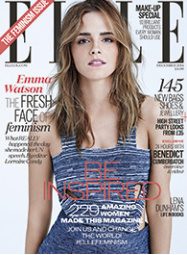
Its a curious one this one, Elle have just released in their December ‘Feminist’ Issue so in the context of making sure my line of inquiry is responsive to current political and social climate I felt I needed to read this. Also, its a fantastic coincidence that the very magazines I have been critiquing as partly responsible for the sexualisation of society; consumerism hunger and sound bite issues of the 21st century are exactly the vehicle for promoting the fact that feminist issues in 2014 are still relevant today to young women.
In all fairness, the words that should perhaps be used now are EQUALITY as Feminism as a word still carries connotations of negativity to women especially where it is confused with being anti-feminine. And so it is with some irony that the cover advertises the contents as Feminism and also ‘new bags shoes and jewellery’. And despite starting the debate on page 193 and finishing at page 231 they make a strong but current and sensitive report on the current political landscape. Key points:
Emma Watson is now the UN Women Good Will ambassador and it follows her recent speach to the UN.
Pay difference – recent report (Folio society 19%?)
‘This is what a feminist looks like’ campaign featuring prominent men wearing the t-shirt (RRP £45 each)
Rebranding from Feminism to Equality may be an easier sell
Reference to #Im not a feminist recent trend on twitter.
#heforshe campaign now launched by Emily Watson as an agent for change to persuade men to engage in feminism,..arguing that in the past the message has been misdirected at women only and the need to readdress the balance to allow for change.
Perhaps more disturbing is the apathy from women from survey results ….unaware of the issues?
Promotion of female politicians views and not their shoes
So in summary, it may be a little light reading for your coffee table but as something that is current and thought provoking to an audience that is interested primarily in the feminine, it has to be applauded. Well done ELLE and it also confirms my area of research is really strong and current.
I have been concentrating today on the large scale painting now called Guilty Pleasure and also doing a number of samples on spray paint text on a union jack background and a painterly ground.
I have by testing improved the way I have laid down the text but this has really been by trial and error and many errors have been made. But yet, little things learnt, like laying black down by stencil and then adding another colour directly on top staight away brings another layer of depth and energy to the finished design. Also, due to the nature of the spray paint and the process itself it creates cracking as it dries and this creates a useful effect.
So I am getting more sophisticated but whilst as a step in the right direction I am pleased overall with GET YOUR COAT as a painting my concerns for development are:
The painting of the woman is far from perfect – left eye is not right but for now I am happy to present at a reasonable standard and move on, as it is more important to develop ideas than spend too long on a vanity project.
The union jack, text and image together remind me of a photoshop layering exercise, mimicking magazine language so on that level it is successful.
The GET YOUR COAT text was all going okay until I managed to get a line of spray paint between GET and YOUR which I had to remove as best I could with turps but it left a stain and as such, I decided to messy up all the other areas around this text to hide by mistake. I additionally dripped red paint using turps down the image, adding to the metaphorical staining of the image and its connotations.
I added the earlier used stencils for REVIEW and ON SALE NOW as they have feminist issues I want to discuss and by putting them on their side instead of horizontally like the main text I wanted them to not compete with the main words. I have spray painted those letters much better so my next attempts I hope will be better polished.
I am a little unsure how this will be read by an audience so I have put 3 works up in the exhibition area to test audience response. I can then consider this before making the next large work. Also, only one of the 3 includes a figurative image. Is it necessary at all or shall I move onto large text paintings instead, although my instinct is to resist this.
Time to stand back now and let this filter through a little and consider audience response.
Some extracts from our group crit have got me seriously thinking. I may know what I intend to do but how will they be interpreted by the viewer, may their message be lost…………
Discussion on post feminism or not-so-post feminism and my current line of inquiry using the language of magazines and advertising to poke fun at our society and the construct in which we are all complicit of having guilty pleasure, seduced by the perfect image either as a literal 2d form of aesthetic or as a life style choice.
Having explained my research and what I aim to do, I need to be very careful of not being complicit and not falling into the same trap of being seduced by the image and not saying anything new. I have to be careful how the work is interpreted by the viewer. DON’T PUNISH THE WOMEN AGAIN.
…not as keen on the union jack as it carries so many connotations and the obvious flaw was an image of Scarlett Johanssan on a union jack would be confusing as she is American. Good point. What am I trying to achieve? Discussion about moving away from the literal attempt at a magazine cover in paint and using the language of the strap lines only. Also discussed that the portraiture may become redundant as the text takes over. I know that I have already identified this as a possible result. If I do text only paintings make sure they are big in scale as there-in lies their power.
Discussion about text only paintings and my love/need of portraiture, which I am not really sure I want to give up. Try doing 2 paintings side by side but in conversation with each other. One with portraiture and one with the text. A juxtaposition of text and the image could be interesting.
Work on my grounds. Layer thinly various coats and sandpaper back. I do need to try this more. You can also add washes ontop of sanded down areas to generate exciting images.
THE TEXT IS THE HOTTEST AREA – so test it and get more sophisticated.
My next step is to text some of the strap lines in paint to see how these can best be applied beyond my initial testings. This will be by development area for this week.